Logo & brand assets
The mark, in the file you need.
Three ragged inputs landing flush on one vertical rule — any shape in, one schema out. Thirteen assets as SVG and PNG, for light and dark grounds, with the colours, clear space and minimum sizes. Free to use when you write about or link to AdaptivMapr.
Primary
The logo, and the one you use by default
The horizontal lockup: the tile, then the name set in Geist SemiBold and converted to outlines, so the file carries no font dependency and renders identically wherever it lands.







Variations
Every other version, and when it is the right one
Pick the version that fits the ground rather than recolouring the one above. The gradient survives on screen; print, embroidery and a saturated ground each want the one-colour file.

Print, stamps, embroidery, anywhere the gradient cannot survive.




Knocked out of a dark or saturated ground, single colour.




Square spaces: badges, event slides, a sponsor wall.

The same, on dark.

The glyph alone on a light ground, when the name is already nearby.
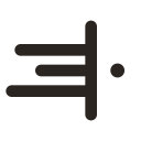

The glyph on dark. Never re-colour the ink mark by hand — use this file.

When the mark sits beside black type that is already doing the work.

The tile the product shows in its own nav. Avatars, app grids, favicons, partner directories.
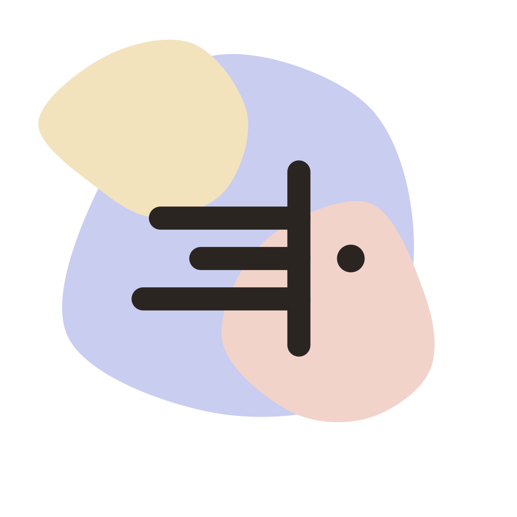


The same tile without the ramp, for a working surface where a gradient would be the loudest thing on screen.



The name alone, outlined. Only when the mark already appears nearby.




The name alone on dark, same rule.



Every asset on this page, SVG and every PNG size.
Construction
Built on the grid it came from
The product takes files that start wherever they start and lands every one of them on a schema you control. The mark is that sentence: three ragged bars, one vertical rule they all end on, and the output leaving as a dot. It sits on a 24-unit grid with 2-unit strokes and round caps.
Minimum size
 22px logo16px icon
The bare mark stops reading under about 20px — the ragged left edge flattens into one block. Below that the app icon is the right asset: the tile keeps the silhouette when the strokes start to merge.
Clear space
Keep clear space around the logo of at least half the mark's height on every side. Nothing — type, a rule, a card edge, another logo — comes inside the hatched area.
Colour
Ink, one accent, and three stains
The palette is monochrome with a single solid accent. The tile is not a ramp — it is three pale glazes, the same three the home page opens on, overlapping and cropped by the tile's own edge. They are a GROUND: never type, never an icon, never a fill behind anything that has to be read. Click a colour to copy it.
The stains
#c9cdf0 · #f2d3ca · #f3e3bd
Three glazes, laid in that order and cropped by the tile — a stain that fits inside its container is a shape; one the edge cuts is paint. The mark over them is ink, never reversed: the glazes are pale by design and a white glyph on them measures under 2:1. The tile's corner radius is 32.1% of its width and the mark fills 53.6% — scale those, do not fix them in pixels.
Typeface
Geist
The name is set in Geist SemiBold, and the whole product runs Geist with Geist Mono for keys, IDs and code. Both are free and open source. Get the font →
You do not need it to use the files: every lockup and wordmark here is outlined, so the name is geometry, not text.
Usage
Please don’t
The mark is five strokes. Small changes are not small.
The name
Write AdaptivMapr: one word, capital A, capital M, no space and no third capital. Not “Adaptiv Mapr”, not “AdaptivMAPR”, not “Adaptivmapr”.
What you may do
Use the mark and the name to refer to us: an article, a comparison, an integrations page, a partner directory, a deck, or your own product where it connects to our API. No permission needed.
What you may not
Imply we built, endorsed or sponsored your product; put the mark in your own logo, app icon or domain; or modify the files. Need a size or format that is not here? Email us.
The mark and the name are ours. This page is permission to refer to us, not a transfer of the trademark.
The product behind the mark
Map any CSV, Excel, SQL or JSON to your schema without shipping raw records to an LLM.